Tag Archives: sign

Another Historic Neighborhood Sign

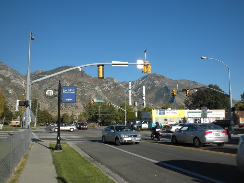
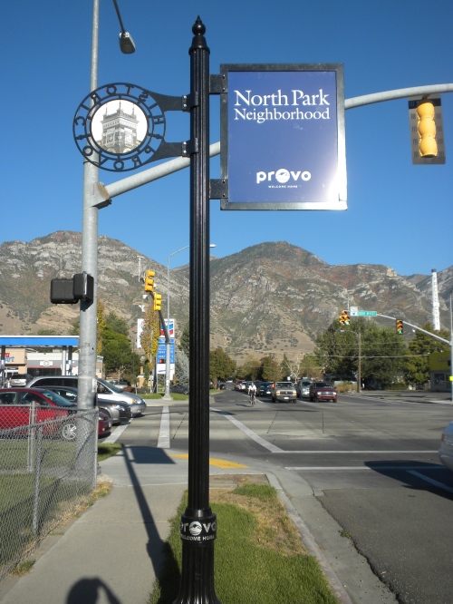
While riding home yesterday evening I passed one more new neighborhood sign. This one marks the entrance to the North Park neighborhood. Like the Maeser sign — but unlike the one in Joaquin — the North Park sign is placed on the proper side of the street and is visible. So that’s great.

This sign is located on the northwest corner of 500 West and 800 North.

Based on this sign, it’s unclear if North Park residents are makers of their own destinies or if they have outsourced destiny production, possibly to the Maeser neighborhood and it’s growing destiny sector.

All said, I like these signs. I’ve read articles arguing for and against the utility of this sort of city element, but as I think about my own experience these signs give me a greater sense of pride. I know that I live in a specific neighborhood with a long and rich past, and when residents are proud of and excited about their city other good things usually follow.

1 Comment

Filed under neighborhood, Provo

Sign, Sign, Everywhere a Sign

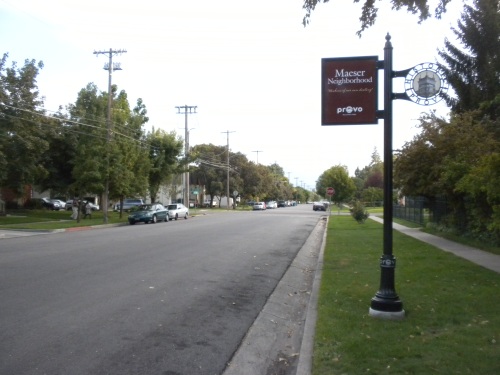
After spending an entire post yesterday complaining about critiquing the cool-but-poorly installed new Joaquin neighborhood sign, Cade Ekblad-Frank alerted me to another new neighborhood sign in the Maeser neighborhood.

This sign for the Maeser neighborhood is located near 200 East and Center Street.

Via Twitter, Cade pointed out that the placement of this sign also is a bit bizarre because 100 South seems to have higher traffic volume than 200 East. I typically only walk in the Maeser neighborhood so I’m not one to say, but if true that would certainly raise questions about the sign’s placement.

That said, this sign succeeds in many basic ways that the Joaquin sign does not. Most obviously, it’s actually visible and not hidden in a tree canopy. It’s also facing the correct direction; the picture above was taken facing south, into Maeser, so unlike the Joaquin sign this one is actually aimed at people arriving in the neighborhood. Overall, then, this is a significant improvement over the sign in yesterday’s post.

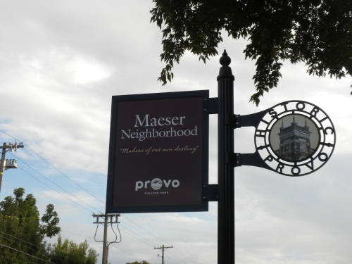
This sign reads “Makers of our own destiny.” Someone else evidently makes destinies for residents of the Joaquin neighborhood because that sign lacks a slogan. Perhaps the Maeser neighborhood produces surplus destinies and exports them?

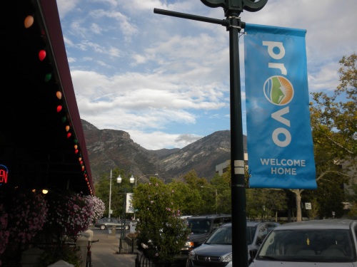
Speaking of signs, while I was out taking the picture above I also saw the new city banners hanging along center street. I don’t know when they went up, but I believe it was recently. As is the case with the neighborhood signs, these banners prominently feature the recently-completed city rebranding.

A new Provo banner, feature the city’s new branding, in front of Los Hermanos.

The new city banners also come in white.

7 Comments

Filed under Downtown, neighborhood

A Good Idea With Terrible Implementation

The Joaquin neighborhood recently got a brand new sign. It’s located on 500 North and roughly 80ish East.
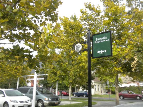
This new sign identifies the Joaquin neighborhood and is located just south of the library.

In theory, this simple sign could help people navigate the surrounding area, bolster neighborhood pride and identity, and even simply alert people that Provo has distinct neighborhoods. In other words, I think there are real social and economic benefits to having signs like this one.

But unfortunately, the sign was installed in such a poor location that it misses out on nearly all of those benefits.

The first problem is that the sign was placed behind two trees — which happen to be the most closely-spaced on the entire block — and is consequently almost invisible. It was so hard to see that I couldn’t even get a good picture of the entire thing.
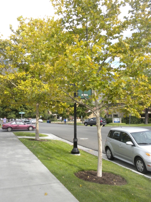
This is a typical view of the sign. A few more steps back and it would have been completely obscured. It’s also worth noting that these trees are only going to get bigger. Odder still, none of the other trees on this block are as close together, meaning the sign was placed in the midst of the densest foliage in the area.
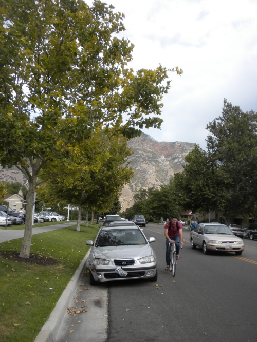
Can’t see the sign? That’s because it’s completely blocked by the trees.

Even moving the sign 10 yards to the west would have made it a bit more visible. As it currently stands, however, the placement is about as bad as it can be.

A sign entirely blocked by two trees is bad enough, but in this case it also happens to be on the wrong side of the street.
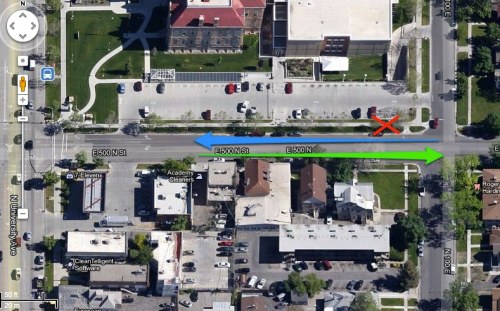
A satellite view of 500 North in Provo, between University Ave and 100 East.

In the picture above, the green arrow indicates the direction of eastbound traffic and the blue arrow indicates westbound traffic. Although this block is technically already part of Joaquin, the majority of the neighborhood lies to the east, in the direction of the green arrow.

Conversely, westbound traffic moving along the blue arrow is effectively leaving Joaquin.

Yet bafflingly, the sign — marked by the red X — is located on the north side of the street and therefore aimed at people traveling west, exiting the neighborhood.

Even more tellingly, the metal “Historic Provo” portion of the sign faces people traveling west. To see what I mean look at the first picture above (you may have to click to enlarge it) and note that the words “Historic Provo” are backward. That’s because I was facing east, toward the Joaquin neighborhood, when I took the picture. Again, the point is that the sign is directed at people leaving Joaquin, which makes no sense and is actually quite confusing.

Though I think these types of elements can be effective and relatively inexpensive ways to enhance a neighborhood, this sign’s placement offers a poignant example of how to waste resources and good intentions. The one ray of hope is that unlike a large building or infrastructure project, this sign could very easily be moved and improved.
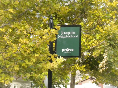
If I didn’t already know what the Joaquin neighborhood was, this confusing and poorly-placed sign wouldn’t have helped me find out.
2 Comments

Filed under neighborhood

Wayfinding and Audience

As I mentioned a couple of weeks ago, I’ve been doing some traveling and, among other things, collecting information for this blog. It’ll probably take me months to go through all the photos and notes I’ve taken, but one of the funnest things I observed on my recent trip was various forms of wayfinding. For example, in Barcelona’s oldest neighborhood, I found these three signs:

Three signs in Barcelona’s medieval neighborhood.

The top piece in that picture is a modern restoration of a Hebrew sign that used to be in the neighborhood when it was occupied by medieval Jews. Christians later forced the Jews out (and killed them), and the middle sign comes from the neighborhood’s later, Christian period. The final sign on the bottom is obviously recent.

It’s fun just to see the historic evolution of wayfinding in a very old place, but these signs also suggest the importance of audience: each successive population used language — as well as other factors like style, placement, materials, etc. — to target a specific group. The Jewish and Christian signs are particularly illuminative; what better way to show that you don’t want a group of people around than to rip out their signs and replace them with something in a new language. (It should go without saying that this is also very sad and is a poor reflection on the so-called Christians that once lived in Barcelona.)

With multiple languages and an emphasis on historical information, the new sign on the bottom also reveals how much tourism and multiculturalism is a part of Barcelona’s economy today. In other words, even if I knew nothing about the city and just magically appeared in front of these signs, I could glean a lot of information about community values and wealth by looking at this wall.

The same could almost certainly be said of all wayfinding, including any examples in Provo. In this context, it’s worth considering who might be the target audience for future wayfinding in Provo. What languages will they speak? What destinations will they be searching for? What values will the signs convey?

Another city I visited, Segovia, asked these same questions and decided to cast a wide net:

Signs in Segovia, Spain.

With graphics and three different languages, these signs are obviously for visitors to the city, rather than locals. The city also must have put some serious consideration and research into which languages to include.

All of this is to say that like all texts and graphical information, street signs and wayfinding target specific audiences. The greater awareness designers have of those audiences, the more effective the signs will be.

Leave a comment

Filed under Provo, travel

Signs of the Times

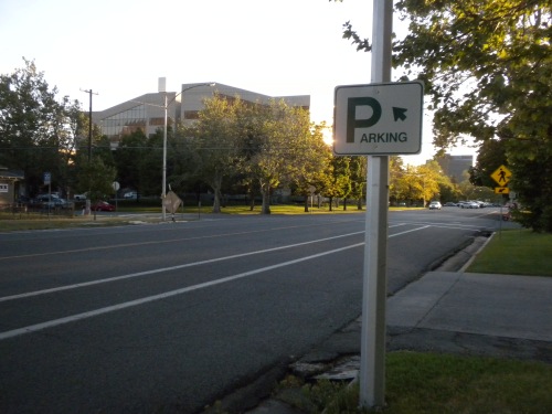
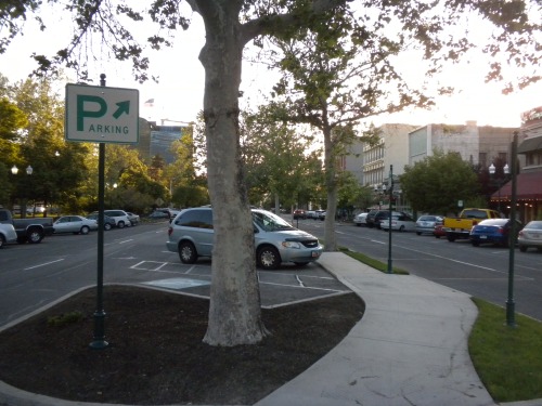
If you’ve walked, or driven, through downtown Provo lately you may have noticed a few subtle changes. The most apparent is probably the addition of parking signs, which I’m fairly certain are new.

100 East Center Street

Roughly 250 East Center Street

100 East Center Street, looking west.

Though I’m not entirely sure where that last arrow is pointing, these signs should help drivers navigate downtown. (I recently suggested Provo add this type of sign in downtown in this post. Little did I know that that process was already underway.)

One bizarre little thing here is that the fonts and colors differ from sign to sign. Look at the letter R in all three signs; in the first two it’s the same but in the last one it’s different. All the other letters also show minor differences between the two styles.

All the signs should function adequately, so this isn’t really a criticism so much as a curiosity. Of course, the two signs with the same font include arrows pointing in the same direction, but I don’t know why the font would change just because the arrow points away from the large P. How and why did that happen?

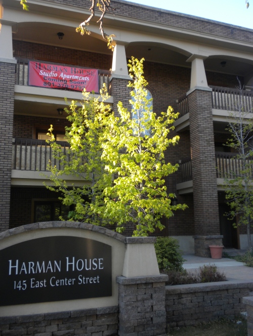
In other downtown news, the upcoming mixed-use Harman House is nearly complete. Sometimes, I lament the times I live in and the aesthetic disasters we continually construct. Then I see a project like the Harman House and take heart.

The Harman House reportedly will have studio apartments upstairs and office space below.

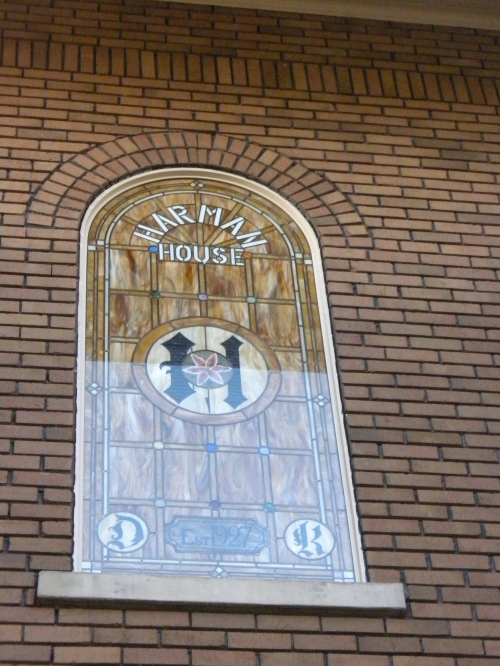
Note in the picture above the sign in the bottom left. That’s fairly recent. The building also now has a fantastic new window:

A new stained glass window in the Harman House. Apologies for the glare.

That window is one of the coolest little additions to downtown that I’ve seen lately. The picture below was taken earlier this year and shows what the window replaced.

The stained glass window replaced an ordinary, semi clear-glass window in the center of the building. Also note the glimpse of the sign in the bottom left. It used to include information about a bank.

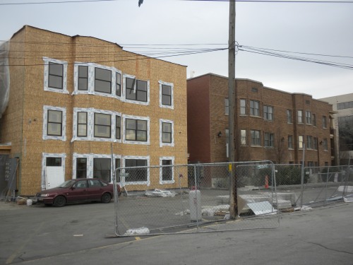
And finally, the picture below shows that the Harman House will include a contemporary addition on the back. To the credit of the building owners, they went through the effort to match most of the brick. That may seem like an obvious move, but Provo is filled with buildings displaying a hodgepodge of brick styles from decades of slapdash add-ons.

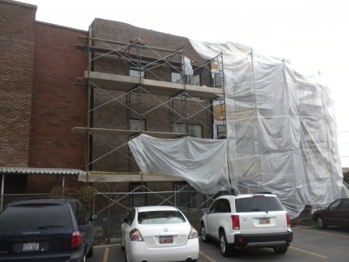
I have no idea what is going on with the red brick in the middle section, but the portion of this building surrounded by scaffolding is a new addition while the sliver of building visible on the left is historic. Up close, the brick doesn’t look identical but it’s a pretty good match. And despite the way this picture looks, he red brick middle section isn’t easily visible from most angles.

The Harman House add-on in mid March. This project is nearly complete. The red brick divides the old and new sections.

2 Comments

Filed under driving, parking